Sunday, December 17, 2017

The Vacheron Constantin Historiques Triple Calendrier - Winner Through and Through

The folks at Vacheron Constantin released two (or four depending on how you view it) versions of the Historiques Triple Calendrier in the form of the 1942 and the 1948.

The 1942 comes in steel and with 2 colour variants - the blue and the burgundy. Featured here is the burgundy version of the 1942.

By the time I got to the boutique, the blue version was already sold - and I can understand why. The pictures alone sets the heart fluttering - I love blue shades. Anyway, I digress.

Inspired by the original reference 4240, the Historiques Triple Calendrier pays tribute to timepieces from the 40s. The difference between the two variants are in the calendar display - either in burgundy or blue.

The Historiques Triple Calendrier 1942 displays the time along with a pointer date and the Day and month being displayed through a window.

The timepiece comes encased in a steel case of diameter of 40mm and with a two toned dial reminiscent of the watches of that era. Very elegant and vintage feel to the timepiece.

Being a triple calendar means that this is not an Annual Calendar or a Perpetual Calendar. This also means one has to adjust Day and Month window come those months with less than 31 days. This is done via the pusher at 10 and 2.

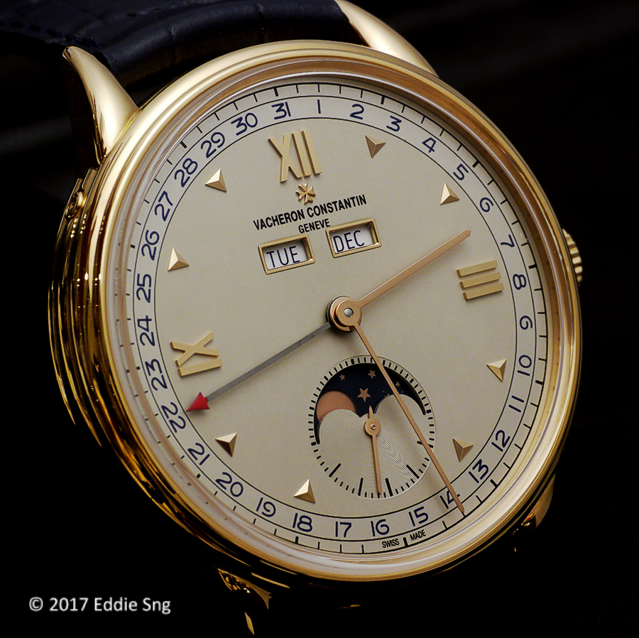
Next up is the Historiques Triple Calendrier 1948 which is encased in a pink gold case and also comes with two variants - one in burgundy and the other in blue. The original reference 4240L was released in 1948, hence the name.

The big difference between the 1942 and the 1948 is the presence of the Moonphase indication found in the 1948. Not just any ordinary Moonphase but one that is highly accurate. This is the blue version of the 1948.

The burgundy version is somewhat more attractive IMHO. Most Moonphase timepieces have the disc in dark shade of blue - to reflect the night sky... burgundy? This is a first I think. Something different. And the date numerals and day & month display in burgundy certainly blends well with the pink gold case too.

The windows of the the 1948 has a pink gold rim giving it a more distinct design. The 1948 comes as a limited edition of 200 pieces of each variant.

Now for the movement - the Calibre 4400.

Both the 1942 and 1948 uses the same base calibre, the manual winding Calibre 4400. The version in the 1942 is named Calibre 4400QC while the 1948 comes with the Calibre 4400 QCL, the L referring to the Lunar (Moon) module. Both beats at 28,800 vph and and has a 65 hours power reserve.

Personally, I prefer the Historiques Triple Calendrier 1942 for a couple of reasons - pricing being the main reason. The 1942 in steel is listed at S$28,600 (inclusive of GST). A great proposition for a Vacheron Constantin. Secondly, the watch feels right... The whole package works for me - the clean two toned dial, the Day & Month window, Arabic numerals and the pointer date - they come together as a very handsome package. For someone like me who needs reading glasses, pointer date (or large date) is preferred as a normal window date is too small.

But that is not to say that I don't like the 1948 - pretty in pink! The burgundy combo works for me - something different. List is S$51,300 inclusive of GST. These are traveling pieces and the straps on the 1948 comes with dark brown croc rather than those seen here.

Sunday, November 5, 2017

The Tudor Heritage Black Bay Bronze Blue Bucherer Edition

At last, my own Tudor and it comes in the form of the Heritage Black Bay Bronze Blue - a Special edition made for one of Europe's largest and oldest retailer Bucherer.

For more of my acquisition, please head over to the Deployant website.

For now, enjoy the photo essay of my Heritage BBBBB...

That blue hue is so...

And the matching blue bronze NATO strap

Nice bronze case with brush finishing

A rather unusual blue and I love it!


And now for a closer look at the timepiece...

Everything scream quality - markers are well finished and polished

Quality finish all round!

Even the inside of the case is brushed to keep consistent with the case itself.


And the snow flake hands are as well finished as one would expect from Tudor

And the big crown - signed.

Chronometer certified by the COSC too


And the case back displaying the Bucherer 1888 - this is not a limited edition so no numbering.

And c closer look at the bronze case and the brush finishing.


And the mandatory wrist shot.

Loving every minute wearing this beauty!

Sunday, October 8, 2017

NOMOS Glashütte & The Hour Glass Singapore - Zurich Weltzeit Collaboration

Back in 2016, NOMOS and The Hour Glass announced their collaboration and behind the scene, a group of collectors floated the idea of a Singapore special edition. And the fine folks at The Hour Glass started the journey of developing the Zurich Weltzeit Singapore Limited Edition.


And what a beauty was unveiled one year on...

The NOMOS Zurich Weltzeit (World Time) Singapore Limited Edition was unveiled with two variants - a Salmon and White dial versions. The Salmon dial was limited to 15 examples while the White, to 35 pieces. 50 in total.

I took to liking the Salmon dial version immediately. Based on press releases, the colour of the dial was a pinky hue and as described, salmon pink. But the final version was anything but.

In most World Time timepieces, the city in feature "by default" is almost always Hong Kong. The Singapore Limited Edition replaced the city to be Singapore. But the Singapore Limited Edition went one step further - the island state is also known to many as "The Little Red Dot". Instead of the "home" symbol on the regular Weltzeit, they replaced the "home" with a little red dot! Brilliant!

And to keep the theme consistent, the Singapore and the little red dot is, of course, in red! Whether it is a coincidence or by design (pun intended), NOMOS has been awarded several "Red Dot Design Awards". I hope the "Little Red Dot" edition wins a "Red Dot Design Award". What an outcome it would be!


When you look at the timepiece itself, the colour of the dial and the texture changes from angle to angle. The dial has a kind of sandy texture. Not only is the dial having a sandy texture, the salmon hue is the first time NOMOS is using this colour.

The way the dial colour comes across to the owner is a vintage feel - lighter in the centre then slowly getting darker as it radiates outwards.

The colour actually looks more bronze than salmon pink, not that I am complaining. The colour combination with the red dot and red Singapore is a stand out. Great job guys!

I intentionally darken the contrast to bring out the sandy grain and the colour graduation of the dial. Note the lighter hue in the centre of the dial and the darkening effects as it graduates outwards.

The steel case is shy of 40mm - a good size case for a World Time.

The crown is signed and the pusher at the 2 o'clock turns the world city ring. The pusher is firm and exact - exactly what I had expected from the folks at NOMOS. On the case back, one can clearly see the words "NOMOS Glashütte Zurich Weltzeit - Singapore Limited Edition" with the limitation number engraved as the bottom of the case.


Now for the movement - the in-house automatic DUW5201 calibre. The DUW 5201 is the first automatic caliber with the in-house NOMOS swing system which I had written about earlier on my NOMOS Metro.

DUW stands for NOMOS Glashütte Deutsche Uhrenwerke and the power reserve on this piece is approximately 42 hours.

Finishing on this piece is as one would expect - finishing worthy of the timepiece.

A close up of the automatic rotor with Glashütte ribbing.

List price on this piece is S$8,560 for both variants which makes it great value.

I believe all the 50 pieces have been accounted for - not surprising really. And with this first piece, I hope that the folks at The Hour Glass will continue with a few more of the same salmon (bronze) dial versions of other NOMOS models. Perhaps the Metro, Tangente or even Tetra... Count me in for the next release!