Saturday, July 14, 2018

Pepsi Anyone? The Tudor Black Bay GMT

Tudor has been making waves since they relaunched the Black Bay range of timepieces and this year in Baselworld 2018, they released another winner - The Black Bay GMT aka Pepsi GMT.

Of course the debate is around their more well known big brother the Rolex GMT II (Pepsi) but with so many brands "adopting" the blue/red scheme, why not Tudor? And I think this is a winning strategy. GMT, Chronometer certified, 70 hours of power reserve, in-house movement, 200m water resistance... what more can one ask for?

At first glance, the Black Bay GMT is well constructed, attractive and for the price that is slightly higher than S$5,000 a solid timepiece for any collection. Maybe not for everyone but for the everyday man on the street, its a winner.

The dial is clean with the signature snowflake hands - one on the hour hand and the other on the GMT hand. Clearly visible is the raised dome sapphire crystal which gives a timepiece a more vintage feel to it.

Unlike the Rolex which has a more red coloured hue, the Black Bay GMT has a darker burgundy colour. The bezel is a bidirectional rotatable 48 notches bezel in steel with 24-hour graduated anodised aluminium disc in matt burgundy and blue.

The crown is signed with the House of Tudor rose logo.

Housed under the hood is the in-house Manufacture automatic Calibre MT5652 which is also COSC certified. The movement which provides about 70 hours of power reserve comes with a bidirectional winding mechanism. So much for so little.

Closer examination shows that the Black Bay GMT punches above its price point - for a timepiece at this price point, the finishing is excellent. Take a look at the markers. Highly polished lumed indices.

A close up of the index - notice the matt blue bezel and the painted tracks?

A closed up shot of the raised sapphire glass and the minutes and GMT hands.

The signature snowflake hours hand and the grainy dial.

The date window lacks a window, not that I care for it but from the pictures of it, I say the stepped window is well done.

The GMT hand also comes with a snowflake design and with lume.

What the timepiece does not display is the fact that the GMT is waterproof to 200 metres - impressive or what?

The printing on the grainy dial is what one would expect from the hour of Tudor.

Nicely printed Tudor logo on the dial.

Inside the case is a brushed ring but unlike Rolex, the serial number is not engraved on the inside.

But what you will see if the words Swiss made proudly adorning the dial right and the bottom.

Concluding thoughts - the Tudor Black Bay GMT reference M79830RB-0001 is a no-brainer for any collector. Handsome timepiece close to the heritage of the bigger brother but yet with a history of its own. The 41mm steel case comes polished on the sides and brushed on top. The timepiece comes with three strap types - a bracelet, leather or fabric strap. I chose the brush steel bracelet which was listed at S$5,380.

Monday, July 9, 2018

The IWC Pilot Mark XXIII - Reissue of the Mark XI

The original IWC Mark XI and Mark XII were the icons of the brand having been the standard issue for pilots during WWII. The early Pilot Mark XI was having a manual winding movement - the Calibre 89. The Mark XI was a time only piece - no date window but the Mark XII came with a date and with an automatic movement. This year, IWC release the Mark XVIII as the tribute to the Mark XI.

By the time I got my hand on a Pilot watch, which was my very first mechanical timepiece, the Mark XII was already sold out (let alone the Mark XI) and the Mark XV was then the only IWC Pilot watch then.

Compare both the Mark XV and Mark XVIII - the Mark XV is 38mm while the Mark XVIII is 40mm. The hands are similar, but the date window is where the difference is apparent. Not only is the date wheel black in colour (as opposed to the white background in the Mark XV), but the positioning of the date window is slightly inside. I find the Mark XV more balanced in terms of aesthetics.

With the size of the timepiece at 40mm, something has got to give... so the position of the date window is inside because the Sellita SW300 movement is not big enough for a 40mm case.

But that aside, the Mark XVIII gives out that vintage feel - much thanks to the yellow markers at 3,6 and 9 and the triangle at 12 which are all quoted with a luminescent material.

Looking at the Mark XVIII tribute piece, I would have thought that this is a tribute to the Mark XII no? After all, the Mark XII had an automatic calibre while the Mark XI is manual winding.

The Mark XII has a date window and so does the Mark XVIII... so what am I missing here?

For me, the hands on this version is right for me... I much prefer these hands which were last seen on the Mark XV.

The difference between this and the Mark XV is the white seconds hand on the Mark XV and the steel hands on the Mark XVIII.

The Mark XVIII luminous markers are well made.

Both at the 12 and at the 6, the markers are painted with the same yellowish luminous material. But notice the numerals too - they are thicker on the Mark XVIII than the Mark XV.

And the crown on the Mark XVIII has the "Probus Scafusia" insignia as opposed to the fish logo on the Mark XV.

And this version comes with a green textile strap which is Made in Italy.

Another look at the Mark XVIII

And...

Now for the Mark XV

I actually like this better.

I get it, the Mark XI is definitely more iconic than the Mark XII being the "first" of its kind. For the Mark XVIII, I would have loved a manual winding calibre as opposed to the automatic Calibre 35111. And one more thing, the date window should go. But that is just me.

Saturday, July 7, 2018

The Ophion 786 - Guilloché Dial Beautifully Done

The Ophion 786 is the second release from this independent micro brand. I have had the pleasure of meeting with Miguel and I find his take on timepieces refreshing.

I offer some photos of my OPH 786. For a full article, please head on to Deployant for the inspiration behind the timepiece. The Ophion 786 is my second timepiece from Ophion Watches - the first being the OPH970.

The first thing you focus on is the guilloché dial - a clean three handed timepiece.

The guilloché is done using CNC machines as opposed to stamping. Gives the dial more depth.

Close up of dial - you can see that the light reflects on the guilloché dial. Something you will not find on a stamped dial.

Another close up shot of the guilloché dial.

And when you examine closely, the ring around the dial resembles a sandwich dial.

To achieve the quality of the rings with the cut-out Roman numerals, Ophion opted for laser cutting to achieve this quality. Pardon the dust on the sapphire glass...

The Technotime movement - a symmetrical movement with double barrel to achieve 5 days power reserve.

Another close up of movement. I love that they use the Technotime movement. Something different from the other standard manual winding movements.

And for the price you pay, the movement is nicely textured - a "hand hammered" effect.

Another look at the dial side.

For a timepiece that is just slightly over EUR2,000, I give this timepiece three thumbs up! If you are looking for something unusual, this is it. Dare to be different, pick up the Ophion OPH 786.

Sunday, December 17, 2017

The Vacheron Constantin Historiques Triple Calendrier - Winner Through and Through

The folks at Vacheron Constantin released two (or four depending on how you view it) versions of the Historiques Triple Calendrier in the form of the 1942 and the 1948.

The 1942 comes in steel and with 2 colour variants - the blue and the burgundy. Featured here is the burgundy version of the 1942.

By the time I got to the boutique, the blue version was already sold - and I can understand why. The pictures alone sets the heart fluttering - I love blue shades. Anyway, I digress.

Inspired by the original reference 4240, the Historiques Triple Calendrier pays tribute to timepieces from the 40s. The difference between the two variants are in the calendar display - either in burgundy or blue.

The Historiques Triple Calendrier 1942 displays the time along with a pointer date and the Day and month being displayed through a window.

The timepiece comes encased in a steel case of diameter of 40mm and with a two toned dial reminiscent of the watches of that era. Very elegant and vintage feel to the timepiece.

Being a triple calendar means that this is not an Annual Calendar or a Perpetual Calendar. This also means one has to adjust Day and Month window come those months with less than 31 days. This is done via the pusher at 10 and 2.

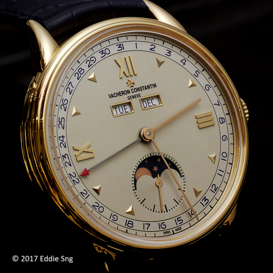
Next up is the Historiques Triple Calendrier 1948 which is encased in a pink gold case and also comes with two variants - one in burgundy and the other in blue. The original reference 4240L was released in 1948, hence the name.

The big difference between the 1942 and the 1948 is the presence of the Moonphase indication found in the 1948. Not just any ordinary Moonphase but one that is highly accurate. This is the blue version of the 1948.

The burgundy version is somewhat more attractive IMHO. Most Moonphase timepieces have the disc in dark shade of blue - to reflect the night sky... burgundy? This is a first I think. Something different. And the date numerals and day & month display in burgundy certainly blends well with the pink gold case too.

The windows of the the 1948 has a pink gold rim giving it a more distinct design. The 1948 comes as a limited edition of 200 pieces of each variant.

Now for the movement - the Calibre 4400.

Both the 1942 and 1948 uses the same base calibre, the manual winding Calibre 4400. The version in the 1942 is named Calibre 4400QC while the 1948 comes with the Calibre 4400 QCL, the L referring to the Lunar (Moon) module. Both beats at 28,800 vph and and has a 65 hours power reserve.

Personally, I prefer the Historiques Triple Calendrier 1942 for a couple of reasons - pricing being the main reason. The 1942 in steel is listed at S$28,600 (inclusive of GST). A great proposition for a Vacheron Constantin. Secondly, the watch feels right... The whole package works for me - the clean two toned dial, the Day & Month window, Arabic numerals and the pointer date - they come together as a very handsome package. For someone like me who needs reading glasses, pointer date (or large date) is preferred as a normal window date is too small.

But that is not to say that I don't like the 1948 - pretty in pink! The burgundy combo works for me - something different. List is S$51,300 inclusive of GST. These are traveling pieces and the straps on the 1948 comes with dark brown croc rather than those seen here.